* This article is meant for advanced UI customization of preferences. For basics, check out Android API guide1.
Settings2 or preferences are one of those semi-essential components that make our app feel more personal to users, by giving them choices to tailor their own experience. Preferences are especially popular in apps for ‘power’ users, where they are presented with a bloat of settings. They are also important in apps where users are opinionated in terms of what makes great experience, e.g. reading apps. Yet building a great settings section in Android has always been a source of pain, at least until recently.
Android SDK comes with 2 choices for developers who want to implement a settings screen, each has its own shortfalls:
PreferenceActivitymay break our inheritance chain, and sorry but no toolbar3PreferenceFragmentis only available from API 11
Many just give up on this and either go for a bare-bone settings screen with horrible experience, or go the long way of having their own implementation. Here comes preference-v7 to the rescue!
preference-v7
With the release of preference-v7, these have been adressed and there should be no excuses now for not implementing a good settings screen. As with other components of support library, preference-v7 provides the same set of implementation as Android SDK, with backward compatibility all the way back to API 7! This means that we get these components for free out of the box:
These components alone should be more than enough to create a decent settings experience. We can basically go with ListPreference for anything with a list of choices, or the beautiful SwitchPreferenceCompat for anything toggle.
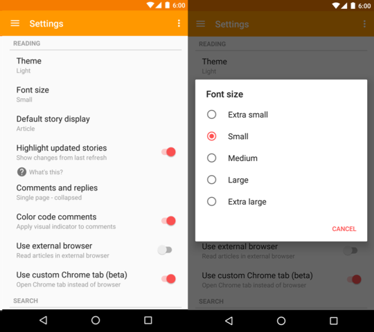
The above screenshot shows an earlier version of settings in Materialistic. Check out the implementation here and here. All great, everything looks neat and material design! But as we add more preferences, each becomes harder to recognize in a long list of preferences. They all follow the same monotonous pattern. The default item layout is plain, and users are forced to go through a try-and-see cycle to get a taste of the change, which they will likely forget the next time.
This calls for a more visual, instant preview of preferences. For example, a theme preference should reflect what each theme looks like (background & text color). A font preference should list each font in its very own typography. Or a list of text sizes should show how big each of them is.
Like this:
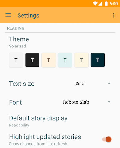
Looking good? Making you feel excited just to look at each option now? If your answer is yes then read on!
TL;DR
What we need to do:
- add preference-v7 to
build.gradleas project dependency (of course!) - set
preferenceThemein our theme invalues/styles.xml, this is required. We can use the default@style/PreferenceThemeOverlayas value for a start - extend
android.support.v7.preference.Preference. This is the base class for all preference widgets - inflate custom layout using
setLayoutResource(int)orsetWidgetLayoutResource(int)via constructor - override
onBindViewHolder(PreferenceViewHolder)with our view binding and click listener logic. We may need to disable the default click behavior if we want to click child view
A custom SpinnerPreference
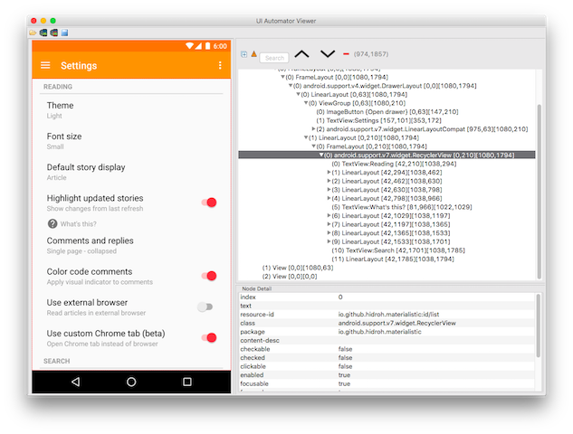
Using uiautomatorviewer to have a quick peek into how preference-v7 layouts setttings screen, we can see that internally it inflates a RecyclerView, where each preference is an item. And as with normal RecyclerView implementation, we are to override some sort of ViewHolder create and bind logic. In this case, it’s an instance of PreferenceViewHolder.
So here goes! Let’s call our custom preference SpinnerPreference, since a Spinner4 control allows us to display a list of choices, as well as selected value.
Our custom widget layout can be as simple as a single AppCompatSpinner. We set this layout as our preference’s widget layout, which leaves the default title and summary for base class implementation.
<?xml version="1.0" encoding="utf-8"?>
<android.support.v7.widget.AppCompatSpinner
    xmlns:android="http://schemas.android.com/apk/res/android"
    android:id="@+id/spinner"
    android:layout_width="wrap_content"
android:layout_height="wrap_content" />public abstract class SpinnerPreference extends Preference {
public SpinnerPreference(Context context, AttributeSet attrs) {
this(context, attrs, 0);
}
public SpinnerPreference(Context context, AttributeSet attrs, int defStyleAttr) {
super(context, attrs, defStyleAttr);
setWidgetLayoutResource(R.layout.preference_spinner);
...
}
...
}The default implementation should take care of inflating our custom widget layout, creating a PreferenceViewHolder, leaving us the task of binding it. Here we wire up the preference click logic to open Spinner’s dropdown, and give it a set of items, which can be passed through custom attributes5 app:entries and app:entryValues, similar to android:entries and android:entryValues of ListPreference. Clicking a spinner dropdown item will persist its corresponding value as string here, but it can be any of the supported types.
<?xml version="1.0" encoding="utf-8"?>
<resources>
    ...
    <declare-styleable name="SpinnerPreference">
        <attr name="entries" />
        <attr name="entryValues" />
    </declare-styleable>
</resources>public abstract class SpinnerPreference extends Preference {
protected String[] mEntries = new String[0];
protected String[] mEntryValues = new String[0];
...
public SpinnerPreference(Context context, AttributeSet attrs, int defStyleAttr) {
super(context, attrs, defStyleAttr);
setWidgetLayoutResource(R.layout.preference_spinner);
init(context, attrs);
}
private void init(Context context, AttributeSet attrs) {
TypedArray ta = context.obtainStyledAttributes(attrs, R.styleable.SpinnerPreference);
int entriesResId = ta.getResourceId(R.styleable.SpinnerPreference_entries, 0);
if (entriesResId != 0) {
mEntries = context.getResources().getStringArray(entriesResId);
}
int valuesResId = ta.getResourceId(R.styleable.SpinnerPreference_entryValues, 0);
if (valuesResId != 0) {
mEntryValues = context.getResources().getStringArray(valuesResId);
}
ta.recycle();
}
@Override
public void onBindViewHolder(PreferenceViewHolder holder) {
super.onBindViewHolder(holder);
final Spinner spinner = (Spinner) holder.findViewById(R.id.spinner);
holder.itemView.setOnClickListener(new View.OnClickListener() {
@Override
public void onClick(View v) {
spinner.performClick();
}
});
spinner.setAdapter(new SpinnerAdapter() {
@Override
public View getDropDownView(int position, View convertView, ViewGroup parent) {
if (convertView == null) {
convertView = createDropDownView(position, parent);
}
bindDropDownView(position, convertView);
return convertView;
}
@Override
public int getCount() {
return mEntries.length;
}
@Override
public View getView(int position, View convertView, ViewGroup parent) {
return getDropDownView(position, convertView, parent);
}
...
});
spinner.setOnItemSelectedListener(new AdapterView.OnItemSelectedListener() {
@Override
public void onItemSelected(AdapterView<?> parent, View view, int position, long id) {
persistString(mEntryValues[position]);
}
...
});
}
protected abstract View createDropDownView(int position, ViewGroup parent);
protected abstract void bindDropDownView(int position, View view);
}Subclasses to this abstract SpinnerPreference should provide implementation to create and bind each dropdown item, which is where we do our magic to spice up the instant preview. Below is an example where each dropdown item has its own typeface, retrieved via a FontCache, which is a map of name and typeface.
public class FontPreference extends SpinnerPreference {
    private final LayoutInflater mLayoutInflater;

    public FontPreference(Context context, AttributeSet attrs) {
        this(context, attrs, 0);
    }

    public FontPreference(Context context, AttributeSet attrs, int defStyleAttr) {
        super(context, attrs, defStyleAttr);
        mLayoutInflater = LayoutInflater.from(getContext());
    }

    @Override
    protected View createDropDownView(int position, ViewGroup parent) {
        return mLayoutInflater.inflate(R.layout.spinner_dropdown_item, parent, false);
    }

    @Override
    protected void bindDropDownView(int position, View view) {
        TextView textView = (TextView) view.findViewById(android.R.id.text1);
        textView.setTypeface(FontCache.getInstance().get(getContext(), mEntryValues[position]));
        textView.setText(mEntries[position]);
    }
}<?xml version="1.0" encoding="utf-8"?>
<TextView xmlns:android="http://schemas.android.com/apk/res/android"
android:id="@android:id/text1"
style="?attr/spinnerDropDownItemStyle"
android:singleLine="true"
android:layout_width="match_parent"
android:layout_height="?attr/dropdownListPreferredItemHeight"
android:ellipsize="marquee"/>Of course don’t forget to set the persisted preference value to our Spinner the next time users visit settings:
public abstract class SpinnerPreference extends Preference {
    private int mSelection = 0;
    ...

    @Override
    protected Object onGetDefaultValue(TypedArray a, int index) {
        return a.getString(index);
    }

    @Override
    protected void onSetInitialValue(boolean restorePersistedValue, Object defaultValue) {
        super.onSetInitialValue(restorePersistedValue, defaultValue);
        String value = restorePersistedValue ? getPersistedString(null) : (String) defaultValue;
        for (int i = 0; i < mEntryValues.length; i++) {
            if (TextUtils.equals(mEntryValues[i], value)) {
                mSelection = i;
                break;
            }
        }
    }

    @Override
    public void onBindViewHolder(PreferenceViewHolder holder) {
        super.onBindViewHolder(holder);
        final Spinner spinner = (Spinner) holder.findViewById(R.id.spinner);
        spinner.setSelection(mSelection);
        ...
        spinner.setOnItemSelectedListener(new AdapterView.OnItemSelectedListener() {
            @Override
            public void onItemSelected(AdapterView<?> parent, View view, int position, long id) {
                mSelection = position;
                ...
            }
            ...
        });
    }
}
Now add this custom preference to our preferences config and we’re good to go!
<?xml version="1.0" encoding="utf-8"?>
<android.support.v7.preference.PreferenceScreen
    xmlns:android="http://schemas.android.com/apk/res/android"
    xmlns:app="http://schemas.android.com/apk/res-auto"
    android:layout_width="match_parent"
    android:layout_height="match_parent">
    ...
    <FontPreference
        android:key="pref_font"
        android:title="Font"
        android:defaultValue="0"
        app:entries="@array/font_options"
        app:entryValues="@array/font_values" />
</android.support.v7.preference.PreferenceScreen><?xml version="1.0" encoding="utf-8"?>
<resources>
<string-array name="font_options">
<item>Default</item>
<item>Droid Sans</item>
<item>Droid Serif</item>
<item>Libre Baskerville</item>
<item>Roboto Slab</item>
</string-array>
<string-array name="font_values">
<item/>
<item>DroidSans.ttf</item>
<item>DroidSerif.ttf</item>
<item>LibreBaskerville-Regular.ttf</item>
<item>RobotoSlab-Regular.ttf</item>
</string-array>
...
</resources>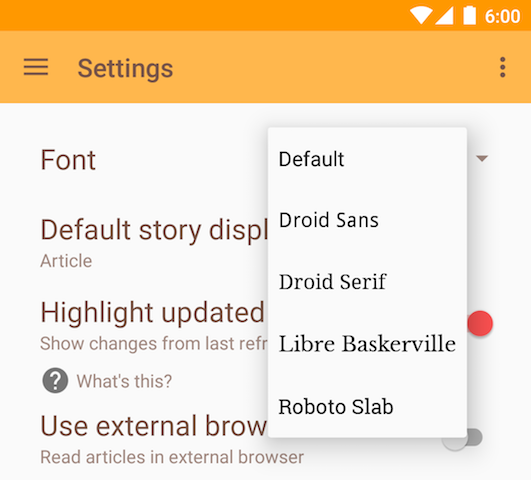
Head over to Materialistic’s Github repo for complete implementation of this and other custom preferences:
- abstract
SpinnerPreference FontPreferenceFontSizePreferenceThemePreferenceSettingsFragmentxml/preferences.xmlvalues/styles.xml
