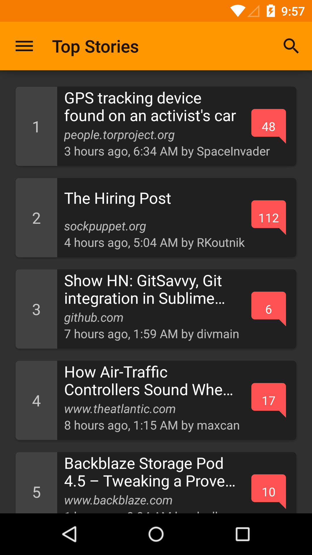
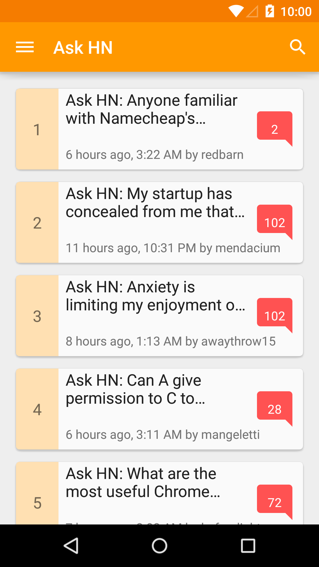
Recently, I have been working on my news reader app for Hacker News, Materialistic. As in any news reader apps, one of the most popular user feature request is ability to choose between light/dark theme for reading preference. Fortunately, supporting multiple themes in Android is quite easy and natural (given that you started properly). This blog explains the approach used by Materialistic to support multiple themes.
What you need:
- At least 2 app themes that extend from base light/dark Android themes. If you use latest appcompat-v7 it would be
Theme.AppCompat.LightorTheme.AppCompat.Light.DarkActionBar(light version) andTheme.AppCompat(dark version). - Color palette1 for each of your theme.
- [Optional] tinted options menu icons for each of you theme. Depends on your implementation approach, tinting can be done automatically, which means you only need one set of icons for one theme; or in my case, I choose to have multiple sets for simplicity.
Let’s start with a light theme for our app:
values/styles.xml
<style name="AppTheme" parent="Theme.AppCompat.Light">
    <item name="colorPrimary">@color/colorPrimary</item>
    <item name="colorPrimaryDark">@color/colorPrimaryDark</item>
    <item name="colorAccent">@color/colorAccent</item>
    <item name="android:textColorPrimary">@color/textColorPrimary</item>
    <item name="android:textColorSecondary">@color/textColorSecondary</item>
    <item name="android:textColorPrimaryInverse">@color/textColorPrimaryInverse</item>
    <item name="android:textColorSecondaryInverse">@color/textColorSecondaryInverse</item>
    <!-- some other theme configurations for actionbar, overflow menu etc. -->
    ...
</style>
values/colors.xml
<!-- brand color: orange -->
<color name="colorPrimary">#FF9800</color>
<color name="colorPrimaryDark">#F57C00</color>
<color name="colorPrimaryLight">#FFE0B2</color>
<!-- accent color: red -->
<color name="colorAccent">#FF5252</color>
<!-- text color: white -->
<color name="textColorPrimary">#FFFFFF</color>
<color name="textColorSecondary">#9E9E9E</color>
<!-- inverse text color: 87% black -->
<color name="textColorPrimaryInverse">#DE000000</color>
<color name="textColorSecondaryInverse">#9E9E9E</color>
AndroidManifest.xml
<application android:name=".Application" android:theme="@style/AppTheme">
    ...
</application>
Explanation for some theme attributes can be found on Android Developers blog2.
Tip
Make a minimal app and try out the style attributes to see what attribute/value we need to set to achieve our desired theme first. As comprehensive as they are, Android documentations on theme attributes, especially withappcompat, are surprisingly lacking.
Options menu icons should have the same color as action bar text color, in our case it’s specified via android:textColorPrimary3, and is #FFFFFF, so we should provide a set of white options menu icons for the action bar.
Tip
Google have made some of the material design icons public on Github.menu/my_menu.xml
<menu xmlns:android="http://schemas.android.com/apk/res/android">
    <item android:id="@id/menu_comment"
        android:icon="@drawable/ic_mode_comment_white_24dp" />
    <item android:id="@id/menu_story"
        android:icon="@drawable/ic_subject_white_24dp" />
    <item android:id="@id/menu_share"
        app:actionProviderClass="android.support.v7.widget.ShareActionProvider" />
</menu>
To enable consistent color, and make our views and texts ready for multiple themes, it’s best that we specify their colors as color resource reference, e.g. android:textColor="@color/textColorPrimary", or via style, e.g. textEmptyStyle style below, using only a limited set of colors from your chosen color palette.
values/styles.xml
<style name="textEmptyStyle">
    <item name="android:textColor">@color/textColorSecondary</item>
    <item name="android:textSize">@dimen/abc_text_size_headline_material</item>
    ...
</style>
That should be sufficient for a simple light-themed material design Android app. In the second part of this blog post, we will make a dark theme and add setting to switch theme during runtime.
